
Overview
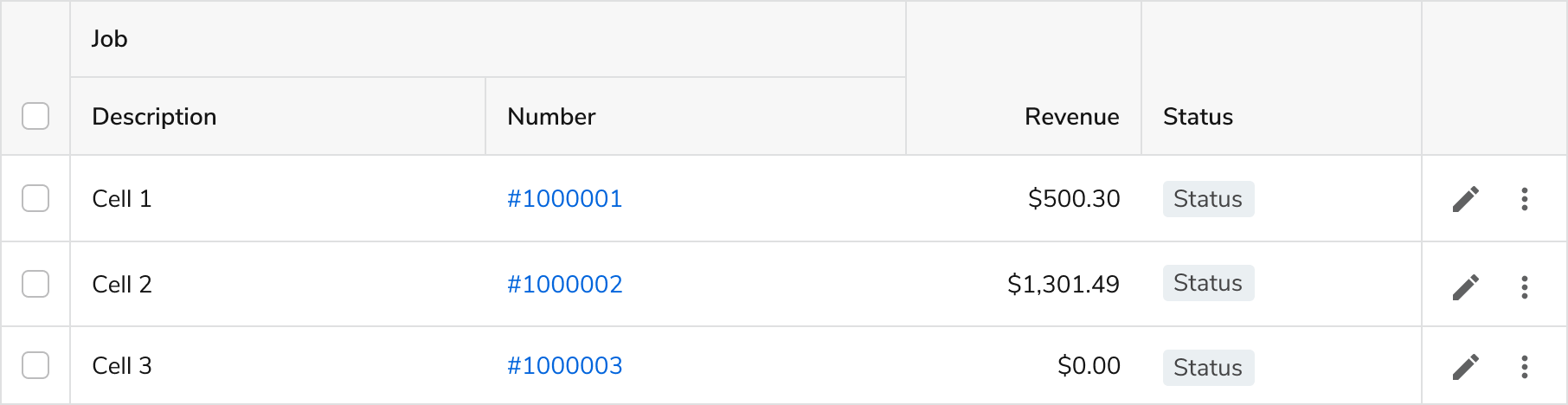
Anatomy
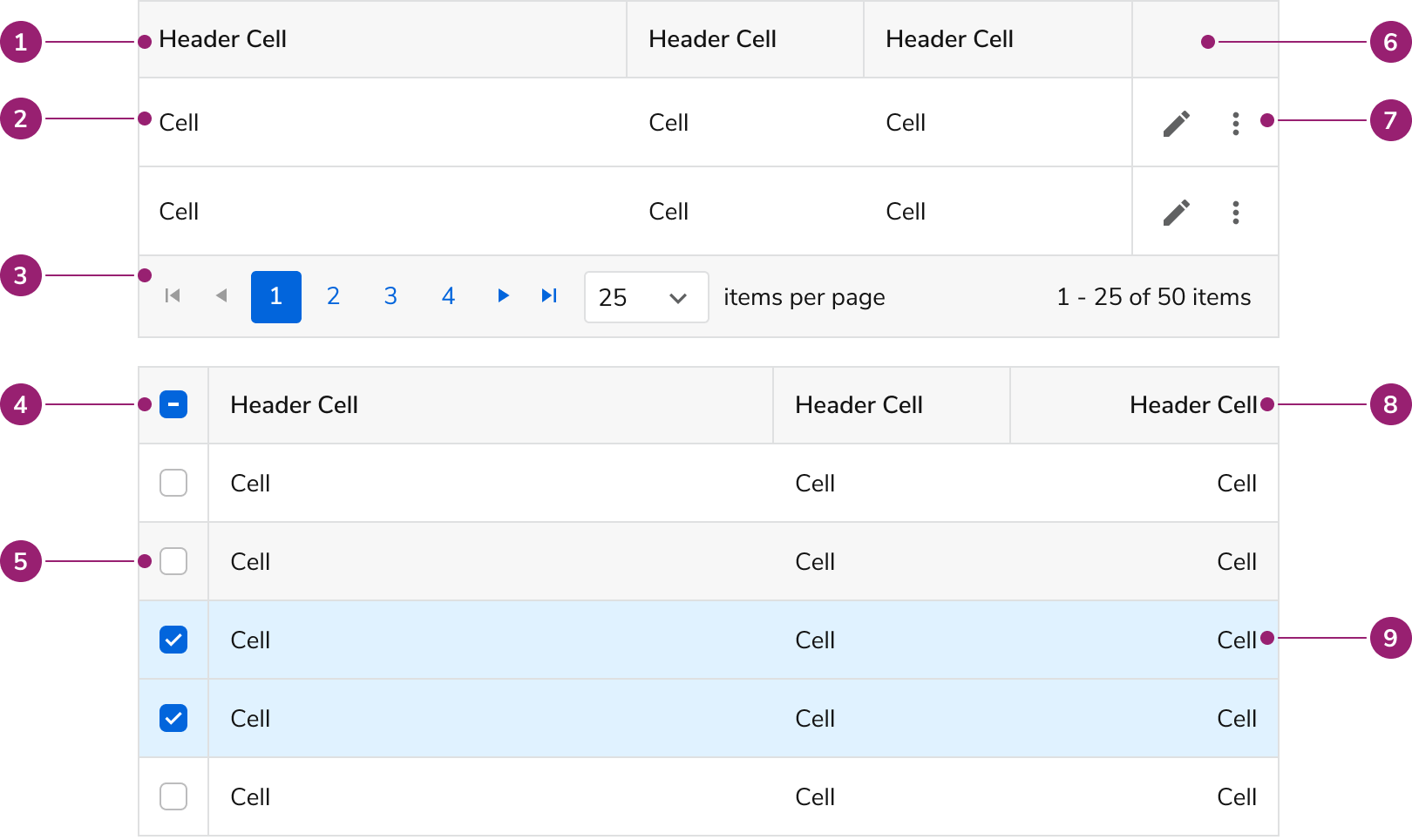
Table Spacing
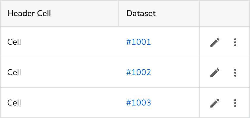
Cell padding is 12px. Total height of a row is based on the tallest element in a row.


Options
Zebra Stripes
Zebra stripes should be used when
- Tables have many read-only columns
- Scanning and comparing table items is important
Zebra stripes should not be used when
- Tables are simple
- Tables are very complex, with multiple interactive elements
- The page UI it’s on is highly complex
Table Headers & Columns
Locked Columns

Locked columns: Checkbox, Name Cell, Actions

Darker borders are applied to locked columns when non-locked cells also have vertical borders.
Locked columns allow users to horizontally scroll a table and maintain viewing of certain columns. They are visually represented with a vertical border.
When to use locked columns:
- When there are 5+ table columns and/or horizontal scrolling is expected.
- If the table has checkboxes and is expected to scroll horizontally, the checkbox plus a key identifier should be locked, and be the left-most column.
- On row-level actions. This should always be the right-most column.
- For other columns, if they are essential to maintain while scrolling, such as a name or ID.
What to avoid when using locked columns:
- Locking more than 4 columns. Locking should only be used when it is essential.
- Locking columns in the middle of the table. Only the left and right edges should be locked.
- Locking a checkbox column in isolation. Pair it with a key identifier.
Resizing
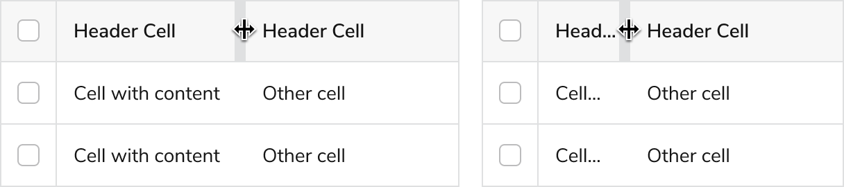
When resize is enabled, a user will also be able to double click the grabbing area to auto resize the column to fit its content.
Sortable


Multi-Column Headers
In addition to text, the Table accepts many different types of content. The following are some examples, along with our recommendations of use.
When using multi-column headers, apply a bottom alignment to headers that don’t have multiple rows.
Custom Cell Content
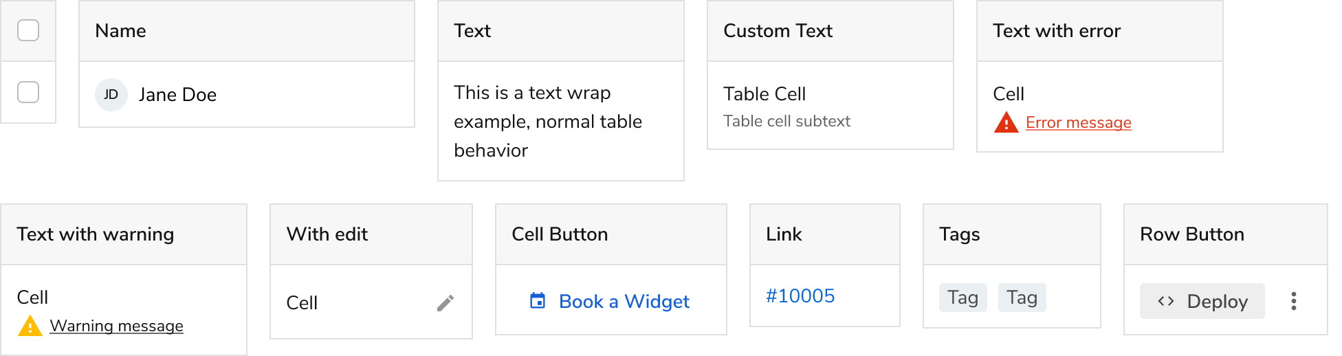
Many of the recommended custom cell stylings for the table. Additional options may also be used beyond this set.
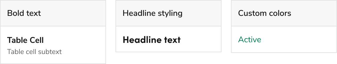
We caution using bold or headline styling. This styling may overpower a page, particularly on busy pages. Use only when it’s essential to call out the cell, that is otherwise not happening at the normal font weight. Text color may be used as long as it maintains a color contrast above 4.5:1 on the background colors the cell may be exposed to.
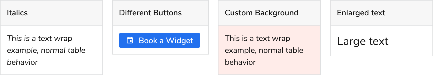
These combinations specifically are not recommended for use.
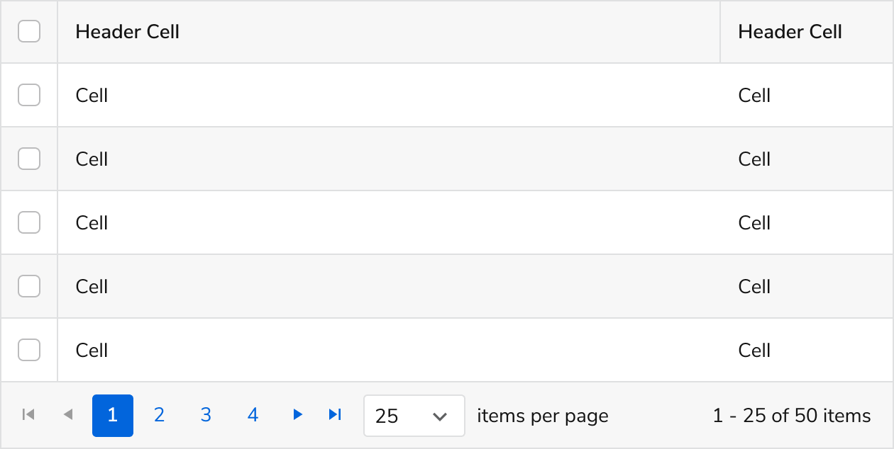
Pagination

- Pagination should be used in most contexts, when 1 or more entry is used. If it’s known ahead of time a table will only use a few entries, a pagination can be omitted.
- A default of 25 items per page is recommended, with increments of 10, 25, 50, and 100.
- A lower default, such as 5 or 10, can be used when multiple tables are on the page.
- User control of items per page should always be used.
- Empty states, whether by no entries, or by filtering with no results, should not use the pagination.
Empty State

- Refer to the Empty State pattern on usage and content guidance within a table.
- Avoid using the pagination when an empty state is used.
Table Actions
Row-level Actions

Row-level actions refer to actions to be taken on an entry as a whole.
- Row-actions should be the right-most column, without text in the header column. The action column should always be locked.
- Actions should use extra small Buttons.


Don’t using other button styles other than the ones used above.
Don’t mix different row actions. If some rows cannot perform the same action another row can, disable the button instead.

Show actions only on hover. Row actions should always be visible.
Cell-level Actions and Links
In general, Links, rather than Buttons, should be used, as most of these actions are navigational.

Cell-level actions can be used, but rarely.

Under special circumstances, links and actions can be mixed. Actions in this case are used in placed of a null value.
Inline Edit

- When using inline edit, apply vertical borders to all cells so that users can more easily associate the icon with the cell.
- Have the save/cancel action placement be in the bottom right to avoid page clipping, as most tables will have a footer to handle overlay spillover.
Bulk Actions & Selection
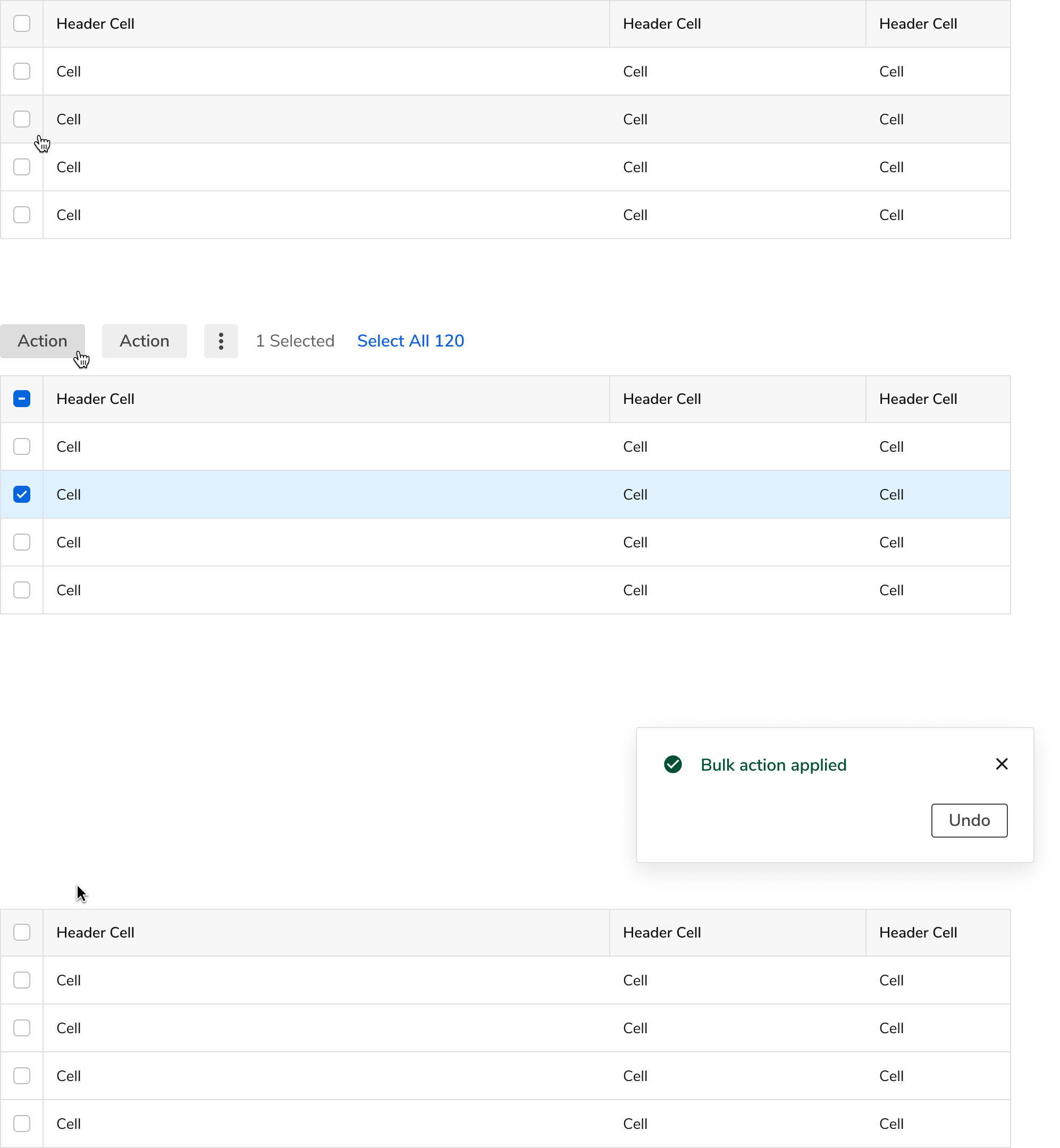
The most common bulk experience. The bulk actions appear only when a selection is in progress. Upon performing a bulk action, deselect the table and optionally display a Toast.
Bulk action button count and styling
Surface 1 or 2 important bulk actions when in the selection state. When using 3+ actions, have the less important and destructive actions should be inside the view more button.
When using bulk actions, stick to the default button. Do not use other styles, including for very important or destructive actions.

Button styling and placement for 1, 2, and 3+ bulk actions.
Select All ‘X’ Flow
Sometimes a user needs to select the entire table data set, rather than just all the entries on the page. When this functionality is needed, provide a “Select All ‘X’” Button after the bulk actions. Technical constraints should be considered when using this, such as in the case of many thousands or unknown number of results.

The microflow to select all. Once all items are selected, a “Clear Selection” option replaces the previous action.

A table can also lack the select all feature, either for UX or technical reasons.
Replacing the utilities above a table with bulk actions
It is common for related table elements to be right above the table. When bulk editing occurs, we generally recommend replacing these actions with the bulk controls.
Preserving the other controls is acceptable, but be mindful of any UX troubles and technical constraints that may arise (e.g. a table search while items are selected).

The preferred method: replace table header controls with bulk controls.

Only use when there is a clear user benefit to keeping both, as this adds technical and user complexity.
Interactive States
Hover

Selected

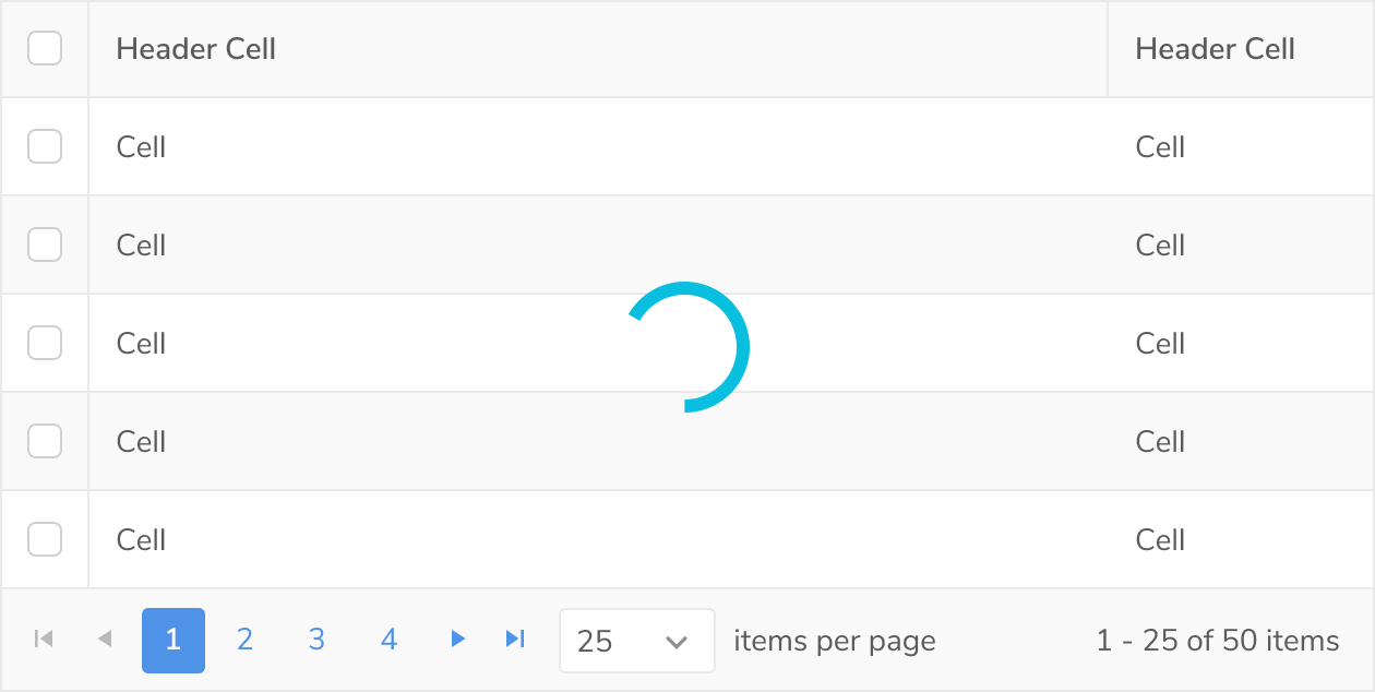
Loading
Errors & Warnings
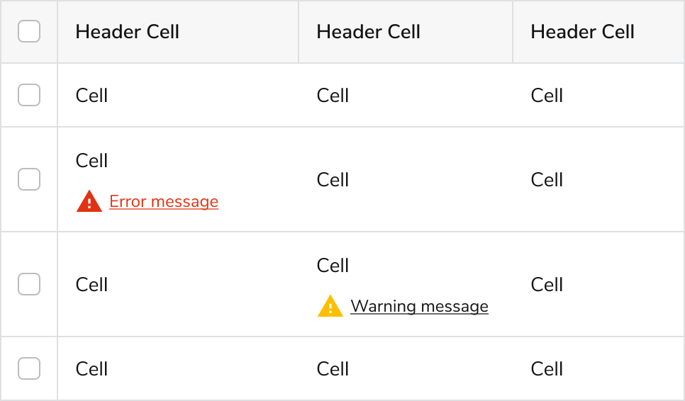
Direct error & warning style does not exist on tables. The suggested styling is to use an inline error and warning text in individual cells.
When to Use
Tables vs List Views
A list view is not a specific component, but a layout option for displaying information. Many lists will exist within Cards in the desktop environment.
Example: A Card List as a navigational item
Example: A configuration, this is stand-alone and doesn’t need sorting of columns
When to use a Table over a list view
- When rows of content are being directly compared against.
- When users benefit from sorting the data to find their own patterns.
- When there are 3+ columns of content in a list.
- When column headers are necessary, particularly when columns should be sorted.
- When little to no extra styling needs to be applied to cell content.
When to use a list view over a Table
- When a row of content would make sense in isolation.
- When the entire row is clickable, particularly around navigation.
- When visual hierarchy needs to be applied to the list content.
- When a grid view display of content would also make sense.
How to Use
Table Height & Row Count
We recommend setting a height of auto, and a max-height of 75% viewport height (75vh) for most tables. From there, setting an items per page count will create an additional max-height, whichever max height value is lower.

When few items are on the page, the table height will be as tall as there are items available.

Viewport max-height will be contextual to the device. On a larger display, such as an external monitor, the max-height may be set around 17 or 18 cell items, while viewing it on a phone in landscape view may only produce 3 or 4 items in view.
Code example of height properties.
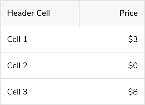
Cell Alignment
In general, table cell content should be left-aligned horizontally, and vertically centered. Certain exceptions exist for numerical values, which can be right aligned.

An example of various alignments being applied properly. Some notable details include the filter icon alignment in right alignment, the center alignment applied to the 2 ID row, and bottom text alignment applied to multi-column headers.
When using multi-column headers, the top header row text should be right aligned when all of the children columns are right aligned (such as in the above example), and left aligned in all other scenarios.
Left Aligned Items
- Text
- ID
- Date / Time / Total hours
- Phone numbers
- Zip codes
- Invoice number
- Tags
- Icons
Mix of numerical value and text (e.g. 2 invoices for $234)
Right Aligned Items
- $ amount
- count / quantity
- % percentage
Editing Experience
Methods to start editing
There are a few ways to prompt a user to modify entries on a table: by cell, and by row, with an option for a dedicated edit mode.
By Cell

By Row

Edit Mode

A dedicated edit mode can also be utilized when additional friction is needed to prevent unintentional edits, such as in business-critical situations. We do not recommend using an edit mode toggle if this friction is not useful.
UI Options for editing phase
After choosing a method of editing, there are multiple UIs that could appear once a user starts to edit:
- Inline editing via an Input or Select
- A drawer
- A dedicated page
Inline editing
Using the Inline Edit component, this is the simplest scenario, and is best used when using cell-level editing and the item being edited uses a simple control, such as an Input or Select.
A Drawer
Using a Drawer is useful with row-level editing. Some other reasons to use a Drawer:
- When there are many editable fields.
- You need to accommodate long and/or complex form fields
- You need to display additional information such as images, long descriptions etc.. without navigating users out of the original page.
- Some of the editable fields are hidden from the current table view. (i.e., hidden columns)
A dedicated page
This approach is suitable when there are many fields or complex interactions that demand more space and attention. You can use the screen real estate to display additional information such as images, long descriptions.
Best Practices
- Content in cells should wrap instead of truncate, if there is enough room on the screen.
- Avoid displaying data that is not relevant to the Table's context.
- Tabs can be used above a Table to filter clearly defined groups.
Related Components
- For a simpler display of data with less functionality, use a Data List